Project
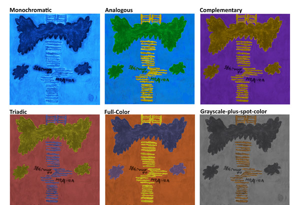
This collection of my work consists of some solo projects and two that are connected to each other. The Cold Iron Productions logo was a class project, that I wanted to experiment with something more fantastical in design. My Stairway to Heaven designs were very experimental for me, because it was originally painted, then brought into photoshop to experiment with, I wanted to see what combinations of colors brought out the piece best I personally think the greyscale one with gold does the best job.
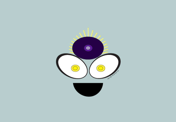
The other two are apart of a themed design for a fictional company I created. The overall company is called Third Eye Incorporated, and everything about them has this mystical feeling where you only slightly trust them. As such the unsettling purple eye, has a constant appearance in anything they own. The other image is one of the products they sell its called control, which is supposed to help people control their emotions, but it is very addictive, and only makes people think they are in control. Which I wanted to represent in the smiling very happy and bright colors, other than the looming purple eye.
My work.


